The Cave, McKenzie Wark

In this project, you will make a series of official announcements related to the (imaginary) school of design that builds from the forms of its implicit visual identity system. You will post these announcements in some dedicated wall space you discover in the building, in a serial rhythm.
Compose the visual identity system as a short script.
In groups of 3, examine official poster announcements from the schools of design and architecture. We will visit the open archive to find evidence over time of the schools’ different visual identities. Write what you see in this evidence. Note particular forms and concepts that strike you and that seem cool. Based on what you see, make note of aspects of the form that interest you: type, color, arrangement, concept, attitude. etc.
From this set of observations, work in your group to “reverse engineer” the posters you’ve chosen into a set of five rules that, if followed, could produce the posters you’ve collected. Address typography, color, layout, image. Imagine these rules as composing or provoking an “open” identity: one that can produce different forms depending how the language is interpreted. The aim is to articulate an open and flexible system that gives you room to play.
From your set of five rules, write a paragraph that will function as the script that is used to produce official announcements in the form of your visual identity.
Extra problem: all group identities should have one thing in common that unifies them. It could be a typeface, a color, or something more abstract. Groups can negotiate together this unifying feature as a revision to an existing rule or as an extra one.
Compile your messages: find/edit/author five messages from each of the following categories.
Sentences from Gamer Theory. Sentences that strike you as interesting and as connected to themes we’ve pursued so far during the semester. Sentences related (implicitly) to design might make sense. The sentences should stand on their own when taken out of context. They can be minimally revised in order to do this.
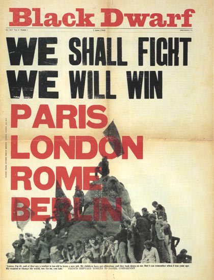
Slogans from May 68 during the student/worker uprising in Paris.
Find them here.
See some in their original designed form.
Pick slogans that would be fun to work with. Pick ones that might have a resonance in our historical moment and/or for life in our design school. It might make a statement about our school’s ideology or ideas about design or more general politics or something else.
Announcements of imaginary events within the school of design.
Imagine an event that you would like to take place in the school of design that we are projectively imagining. It could be a completely imaginary event, or one that has taken place elsewhere but which you would like to transpose to our school. This is a speculative exercise in imagining the space of our school as a space you want to belong to. Imagine events that would happen in an utopian version of our school. Or something that comments on things as they are, that draws attention to some problematic aspect of how things are. Or something that would just be fun: something that you love, and that you could imagine transposing to our school.
Pick an oblique strategy from the online deck. If the first “card” doesn’t make sense, pick another until you get one you want to work with — but don’t endlessly pick new cards. Get five maximum and pick the one that feels most the interesting and feasible and go with that.
Use the oblique strategy to iterate the design of one of your photoshop typography posters. Interpret the strategy as a prompt with which to develop the field of forms you’ve so far set in your poster. Use your interpretation to further develop the typography or the content (or their relation). This is an open prompt — you can interpret the strategy in many ways, at the level of form, content, production process, etc. Find your idea and run with it.
After you’ve interpreted and executed the oblique strategy and produced a new typographic composition, pick another card from the deck and do it again; apply the new strategy to the iterated composition.
Do this again: so you have three new compositions which successively build on each other, beginning from one of your photoshop compositions.
These cards evolved from our separate observations on the principles underlying what we were doing. Sometimes they were recognized in retrospect (intellect catching up with intuition), sometimes they were identified as they were happening, sometimes they were formulated.
They can be used as a pack (a set of possibilities being continuously reviewed in the mind) or by drawing a single card from the shuffled pack when a dilemma occurs in a working situation. In this case,the card is trusted even if its appropriateness is quite unclear. They are not final, as new ideas will present themselves, and others will become self-evident.
Get Your Oblique Strategies Here!
One article, among many, about Oblique Strategies.
Another.
Ambient Genius, Sasha Frere-Jones
The Wikipedia article.
Jan Tschichold
from The New Typography, translated by Ruari McLean (1928, 1998)
a.
Read “Robin Fior” by Richard Hollis. Consider his work and biography and especially the different formal and material senses of revolutionary typography that Hollis elucidates for Fior’s work. What formal qualities does revolutionary typography exhibit, according to this account? Prepare to discuss this in class.
b.
Explore the radical graffiti instagram account. Pick three graffiti texts from among the posts. Transcribe them. Find texts that strike you as powerful, clever, interesting, poetic, or important. They should be related in some sense and work together as a set, as a list or as a paragraph. Their relation can be obvious or not, but develop a sense of how they work together and condition each other and develop a meaning together. They can clash or echo each other. Each text should contribute something new to the overall meaning.
c.
Read “Futura, a Typeface of our Times.” Think about the arguments made for Futura as uniquely expressing qualities of the early XX century, and consider a contemporary typeface would be that had a similar relation to our moment in history. Think about what it means for a typeface to express its time. After doing this reading and thinking, pick a typeface that can function in this way. It could be Futura.
d.
Typeset your three graffiti texts together in a way that typographically demonstrates their radical/revolutionary content. Use “a typeface of our times.” Think about the ways typographic and design form can connect to political meaning according to Fior/Hollis. Make these form/content connections and/or propose a new ones in a set of three posters. Produce three posters that differently demonstrate these relations. Use the same text, and only these texts, in each poster. Each poster can reorder the three texts. Think about the semantic structure of your texts and how to give this typographic form.
a.
Read the attached passage from Jan Tschichold’s The New Typography. Identify within this text three sentences that make a statement about typography or graphic design. Look for sentences that make a bold or interesting statement about typography and its relation to the present moment (the present moment of the writing being 1925). Or about the relation of typographic form to content. Another criteria for selection is that the sentences, when you read each individually, should stand on their own. Look for a slogan-like power in the sentences you find. You might agree or disagree with any of the sentences.
b.
Typeset each sentence, as you did in the previous exercise, in a “revolutionary” way, that is: in a way that comes immanently out of the logical meaning of the sentence, rather than according to a form that is imposed from without. Be guided by the spirit of Tschichold’s argument about new typography. But also consider how typographic form can complicate or contest the meaning of its content. An additional constraint: typeset your posters in photoshop and find photoshop-specific forms (effects, filters, etc) for your typography. Dig into the software, which was designed for image editing, to discover new possibilities for digital typographic form. Finally, think about the relation of these three posters to your earlier three: altogether they should make some kind of sense together as a set.
Curate 3 posters from the People’s Graphic Design Archive. These should be posters you like and would want to hang in your room. Come to class ready to talk about why you think the posters you chose are cool, interesting, appealing, important, whatever. Tell us very succinctly, in one sentence, what the vibe of the poster is and why you find it compelling. (You have 5 minutes to present the posters.)
With the three posters you chose in your mind, describe in words a fourth poster that would belong to the set you’ve curated. This is a poster you’ve never seen before. This is a poster you would want to hang in your room. Imagine the poster, formulate its concept, borrowing and expanding from the 3 posters you curated. Describe this poster as succinctly and evocatively as possible, in one paragraph. Your vision of the poster, or at least its verbal formulation, might be incomplete, but some aspects should be clear. You can describe the content or the form or both, or something else, like how the poster makes you feel or some other effect it might have on a viewer. The poster in your mind should not be objectively complete in every sense. Focus your description on the concept of the poster and its vibe. The poster does not need to be about graphic design, but graphic design should be important to its overall effect or meaning.
The “verbal picture” you produce will be used by your classmates as a script to execute, so keep that in mind — which is to say, write it to be read as an instruction that will require interpretation.
Print 3 copies of your text on a letter size sheet.
Exchange texts with your classmates. Everyone should have 3 different texts.
Use your texts to produce 3 posters that follow the instructions. Think about the constraints that each text imposes. Think about what the text leaves open and where it calls for an interpretation. Start sketching your posters one at a time or alltogether. The additional constraint is that all three of your posters should have some single investigation in common: a set of forms, an attitude, a vibe. As you go and work out your interpretations and formalize your instruction texts as graphic design, develop your own “theme” that works itself through all three posters. You don’t have to come up with this unifying thing in advance, but try to develop it as you work, immanently.* Your theme could be at the level of form or content or the relation between them. At the end you should formulate this theme, or thing in common, in language.
Begin with this content: the standard test message “Hello, world.” Design the message in Google Drawing. Unlock every option in this primitive software for producing graphic form. Use type and shapes, anything except an image.
By the end of this process, the real “content” of your drawing should become the technical medium itself, the software you used to produce it. Play with all the possibilities for form embedded in this particular tool. Say “nothing” in order to explore and reveal the universe of constraints and possibilities that reside within a simple software.
As you discover and work with these latent forms, also imagine that you are saying hello to the world of graphic design, in whatever tone of voice makes sense. The sentence should remain legible. Produce three significantly different “drawings,” each of which expresses a different tone of the salutation. Export your images as a jpgs and print each on a letter sized sheet.
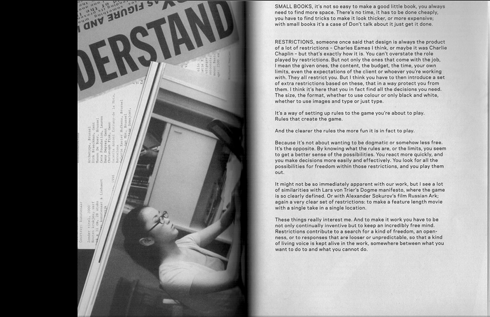
This very short text is from Recollected Work, a retrospective of projects by the Dutch designers Mevis and van Deursen. The text is a sort of transcription produced by Paul Elliman (the editor of the book) after talking with the designers.
Read the text and consider the following:
Mevis and van Deursen describe their design practice as a game playing activity. How does this game work? What do you think of the entanglement of freedom and constraint which their description implies? How can a “living voice” be engendered in this sort of practice?
Think about your own experience as a designer. Consider a specific project you’ve worked on or imagine a hypothetical one — in what sense do the restrictions structure the work? How might you imagine future work in which conscientiously identify constraint variables which you set in order to play the game of your work?
Write and print a 100 word response on a single letter-sized sheet of paper. Use one typeface that begins with the letter “T”.
1. Find ten sentences from Gamer Theory and ten sentences from the particular game rules you found, in print or online. One criterion for picking these sentences is how well they can stand on their own, apart from the context of the text and the game.
2. Find twenty images in a book or online, using the following keyword queries:
rule, order, work, play, cooperation, competition, improvisation, resistance.
These images will illustrate, or otherwise accompany, the sentences you find, so you can imagine their relation and that might be part of your criteria for selection. But, as with the sentences, also aim for images that are interesting on their own, as singular images expressing the various keyword attributes above.
Make each image grayscale and adjust for clarity and contrast.
3. Typeset the sentences on a letter-sized sheet of paper, using Arial regular. The type size can be 12, 24, or 48 points (with the same line spacing.) Make a three column grid on the letter-sized sheet. The width of each sentence can be one, two, or three columns. Fit as many sentences as you can on each sheet.
Size and arrange the images in the same manner in your three column grid.
4. Print your sheets and cut out, with an exacto blade, the sentences and images from the sheets. Make ten different compositions, putting together two sentences and one image in each. Make your compositions, quickly!, directly on the Riso glass. Print fifteen copies in one color.
Find an image that relates to the concept “under restraint.” Make the image large enough to fit on a letter size sheet, portrait orientation. Choose one retouching or painting tool from the photoshop toolbox and vigorously edit the image using only that tool. Test the tool : make it do something it wasn’t designed to do. Investigate all possible variables and parameters for the tool. Make 10 iterations that each visually communicate a different sense of the concept of freedom versus constraint.
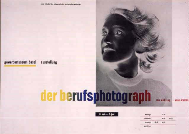
Find an NFT artwork in an online market and make a poster that publicizes it. Include its title, artist, price, url, and any other pertinent information you can find. In addition to communicating this information, the poster should also make visible the digital technology that produced the artwork. And/or: the production of the poster should use new technologies which are somehow made visible in the poster itself. In either case, the poster should experiment with and visibly bend this technology. Type should be precisely and significantly organized in relation to itself and to the featured image. Think of Tschichold’s Der Berufsphotograph as a precise, but not a literal, analogical model.
From David Reinfurt
which could translate to
1. A black
2. E white
3. I red
4. U green
5. O blue
from Paul Gangloff
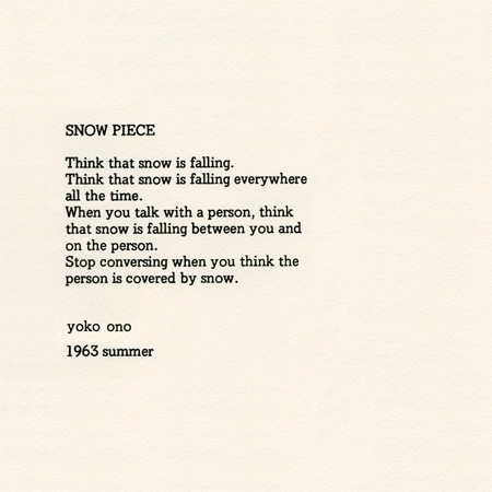
In the spirit of Alison Knowles and Yoko Ono, write a script in a single concise paragraph that specifies an event which might produce — among other things — printed material. This is an exercise in both precision and speculation, in detail and possibility, in material specification and the evocation of social and political lifeworlds in and beyond graphic design.